GRAPH: 2017 carbon dioxide emissions worldwide

Nikola Belopitov via Pixabay
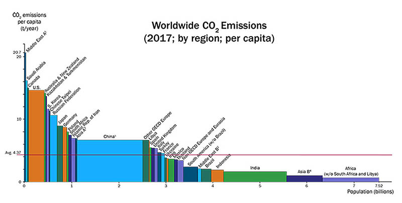
Below is a graph of carbon dioxide emissions per capita for different regions of the world. The total emissions of a region is represented by a rectangular area. The height of each rectangle is proportional to the emissions per capita, and the width is proportional to the population of the represented region. The regions are sorted by emissions per capita, from the highest to the lowest.
Summarise the information by selecting and reporting the main features, and make comparisons where relevant.
ポリゴとは?
塾講師、学校教師など英語のプロたちから絶大な信頼をうけるネイティブの英語講師陣による、英語校閲&解説サービス。あなたの理解度・満足度が100%になるまでおつきあい! 入会金/会費無・利用時払い可能・1文字USD2¢から・退会自由・プライバシー厳守。英語力UP効果抜群のブログも展開中です。通常12時間以内、最長24時間以内の返信をお約束します。あなたの英語の文章がより洗練され、効率よく勉強できます。
- 入会金無料
- プライバシー厳守
- 利用時払いも可能
ブログ
- Goodbye! For now...
- それでは、また
- Daily Habits That Improve Your Writing Over Time
- Business Writing Tips for Non-Native English Speakers
- Why Business Professionals Must Write Well - AI Can't Do It for You
- Meet Our New Writing Coaches!
- Understanding TOEIC
- Writing well is still essential in today's world!
- 通貨と価格変更のお知らせ
- Which is the right English Test for you?