ホーム / Homework Tags / GRE

GRE

Shark underwater at night

Below are bar graphs showing fatal shark attacks in Southern and Western Australia. Summarise the information by selecting and reporting the main features, and make comparisons where relevant.


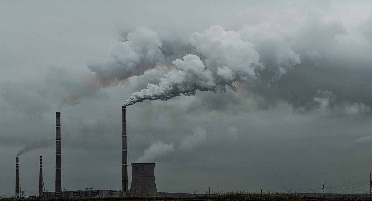
Smokestacks against smoggy sky

Below is a graph of carbon dioxide emissions per capita for different regions of the world. The total emissions of a region is represented by a rectangular area. The height of each rectangle is proportional to the emissions per capita, and the width is proportional to the population of the represented region. The regions are sorted by emissions per capita, from the highest to the lowest.

Summarise the information by selecting and reporting the main features, and make comparisons where relevant.

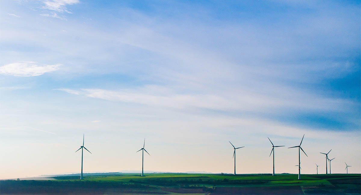
Wind turbines in a field

Below is a pie chart of the sources of electricity generation in California, USA, in 2018. 

Summarise the information by selecting and reporting the main features, and make comparisons where relevant.

Calculator and notepad placed over stack of USA dollars

The graph below shows the average wages for salaried and full-time workers in the U.S.

  1. Describe the information in the graph. What does it tell you?
  2. Why might it be important to have this data? Who might want to know, and how would they use it?

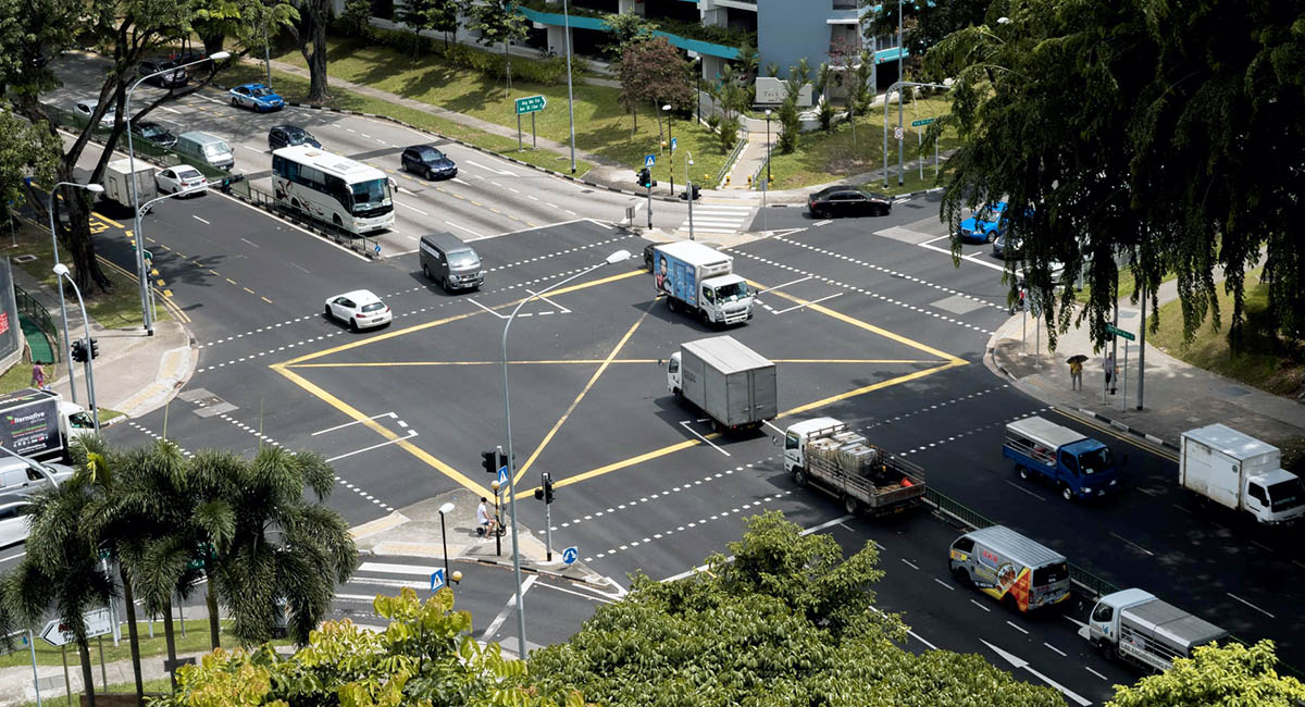
Intersection with cars, trucks, and buses

The graph below shows vehicles counted at an intersection over a 4-minute span of time. 

First, describe the information in the graph. What does it tell you?

Then talk about why it might be important to have this data. Who might want to know? How would they use it?


[Graph by Jimmie via Flickr]

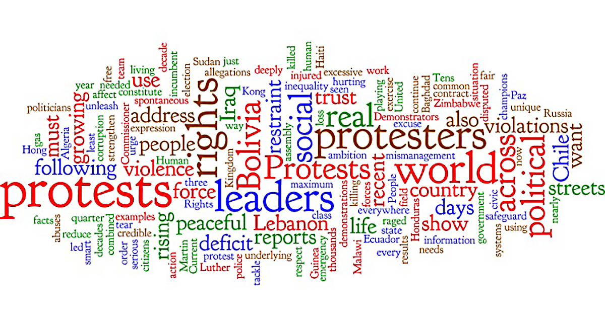
Word cloud of UN article about global protests

Above is a Wordle™ * of a news article. Summarize the article by interpreting the words and frequencies shown.

*A Wordle™ takes all the words in a text and arranges them randomly. The size of the word shows the frequency with which it appears—larger words appear more often.

Three older women seated on a park bench, talking

Below is a pie chart showing the global percentage of English dialects in 1997. Summarise the information by selecting and reporting the main features, and make comparisons where relevant.

[Image by M. W. Toews via Wikimedia]

Two desktop computers with a website design on the screens

Below is a pie chart representing the distribution of languages on internet websites in 2014. Summarise the information by selecting and reporting the main features, and make comparisons where relevant.

[Image by Day Translations Team via Wikimedia]

Melting polar ice cap

Below is a graph of land and sea temperatures from 1950 to 2018. Summarise the information by selecting and reporting the main features, and make comparisons where relevant.

*Lowess smoothing = averaging scatter plot values over a certain span to create a smooth line.

[Image by NASA via Wikimedia]

Young boy reading a book on his bed, with a plush toy panda bear

Below is a bar graph showing literacy rates in several regions from 1990 to 2015. Summarise the information by selecting and reporting the main features, and make comparisons where relevant.

[Image by UNESCO via Wikimedia] 

ページ

GRE を購読